Golden Lance for Best UI in 2025
Immersion is difficult to achieve. In games, more than any other medium, due to the sheer volume of information that has to be passed on to the player at any given time. Health status, ammo quantity, item selection, party makeup, there is so much that a player needs to know. Game developers are set up with the difficult task of ensuring you, the player, understand all of it at a moment’s notice. As if that weren’t enough, they also want you to see and appreciate the gorgeous world they have built. It is a balance of utility and aesthetic that these three games absolutely nailed. With that said, here are the winners of Lords of Gaming’s 2025 Golden Lance Award for Best UI.
Best UI – The Outer Worlds 2
Obsidian crafted a user interface that is both unobtrusive and visually engaging, avoiding the clutter that plagues many modern RPGs. Smooth animations when switching skills or gear add polish without overwhelming the player. The UI’s streamlined layout ensures that menus and indicators support gameplay rather than distract from it. This thoughtful balance of functionality and flair makes every interaction feel natural and intuitive.

Beyond aesthetics, the UI enhances accessibility by offering simplified options to reduce cognitive load and customizable color palettes for loot rarity. These features ensure that players of varying needs can enjoy the game without compromise. While sonar highlights occasionally cause minor frustration, the overall system remains clear and effective. By combining style, accessibility, and usability, The Outer Worlds 2 sets a benchmark for RPG interfaces and deserves to be the winner of LOGNET’s Best UI award for 2025.
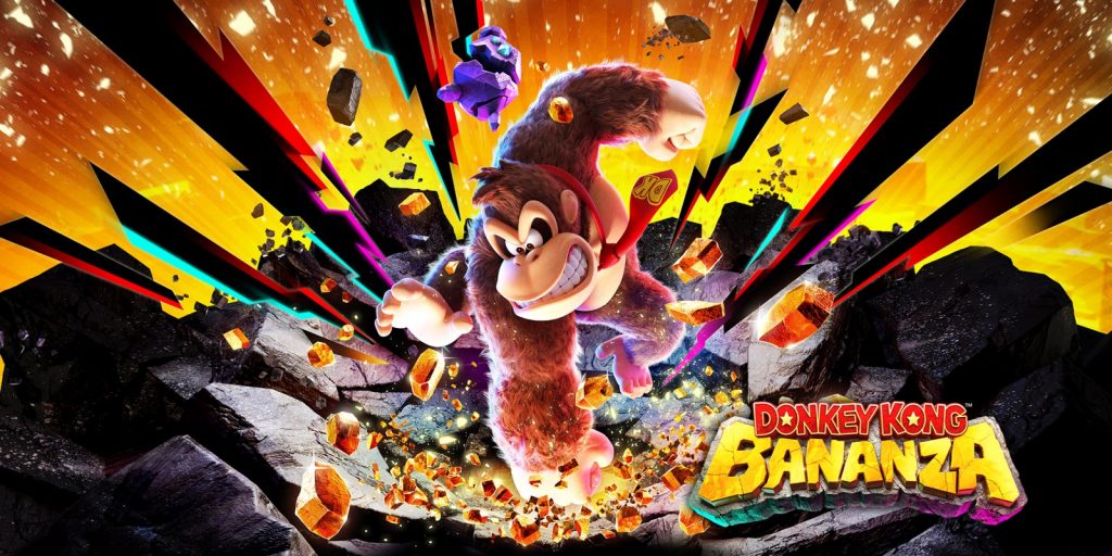
Runner-Up – Donkey Kong Bananza
Nintendo EPD delivers a masterclass in interface design with Donkey Kong Bananza, creating a UI system that’s as functional as it is visually enchanting. The game’s intricate 3D map system transforms navigation into an artistic experience, presenting each underground layer as a fully realized miniature diorama that players can swirl around and examine from every angle, making it feel less like a standard game map and more like peering into a living, breathing world in your hands. This design choice proves essential for maintaining player orientation in the game’s sprawling, destructible environments, where you can tunnel through terrain in any direction, allowing you to zoom out and instantly understand your position.
The dynamic UI elements seamlessly integrate into the experience with smooth transitions, contextual pop-ups that elegantly display Banandium Gems and collectibles. Even subtle touches like the “Ad Lib” font—a deep-cut reference to 1990s Donkey Kong Country promotional materials—demonstrate the development team’s meticulous attention to both aesthetic cohesion and series history. For crafting a UI that enhances exploration, respects player clarity, and elevates the overall experience through thoughtful 3D spatial design that makes navigating a vast underground world feel intuitive and delightful, Donkey Kong Bananza earns its spot as runner-up for the Golden Lance Award for Best UI Design of the Year.