
Immersion is difficult to achieve. In games more than any other medium due to the sheer volume of information that has to be passed on to the player at any given time. Health status, ammo quantity, item selection, party makeup, there is so much that a player needs to know. Game developers are set up with the difficult task of ensuring you the player understand all of it at a moment’s notice. As if that weren’t enough, they also want you to see and appreciate the gorgeous world they have built. It is a balance of utility and aesthetic that these games absolutely nailed. With that said, here are the winners of Lords of Gaming’s 2024 Golden Lance Award for Best UI.
Winner – Metaphor: ReFantazio
Video game UI is often challenging to execute effectively, and God of War: Ragnarok serves as an example of poor implementation. For instance, the in-game map is extremely difficult to read clearly, leading to a frustrating experience. Additionally, the overall inventory menu suffers from poor design, further detracting from the game’s usability.
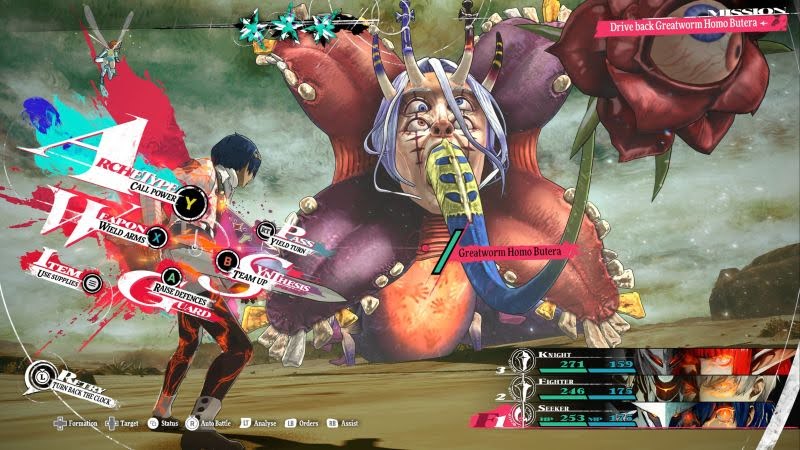
On the flip side, there are examples of how a well-designed UI can elevate the gaming experience, such as in Metaphor: ReFantazio. Features like the map and menu are not only clear and easy to navigate but also visually engaging, with flashy and animated elements. Additionally, the way characters shift and menus move during combat creates the impression that the gameplay is faster than it is, enhancing the overall experience for players. The release of Metaphor ReFantazio is a reminder that Studio Zero and Atlus have mastered top-tier UI design.
Runner Up – Eiyuden Chronicle: Hundred Heroes

When it comes to the Best UI of the year there were a few good choices for this category. However, once again I believe Eiyuden Chronicle: Hundred Heroes takes the cake. From the way everything looks on the screen from the turn order at the top of the screen to the characters and their stats on the right of the screen it all looked very crisp and clean. It wasn’t taking up the whole screen like some UIs, nor was it overbearing. There are also instances where characters might have text conversations in the bottom right of the screen that doesn’t interfere with the gameplay and distract you.